Friday 28 September 2012

Illustration: Frank Quitely, Cover to Batman and Robin #6, 2010

 Image source: http://dangerousdays.tumblr.com/page/8

I chose this because: serene outlines (like, they're not flamboyant flicking about or jutting in/out, they look like they are sort of a coating on a 3D model that was already there, what a terrible description...), picking out sort of blunt, honest looking forms and textures, they're very physical, he puts in enough detail and textures and leaves enough white space, the blocks of black are minimal, that it makes you focus on the volume of all the things he's drawn rather than the light over surface of the whole image. That plain kind of gritty display of subjects, letting subjects speak for themselves seems British, or stereotypically British, like an old stiff upper lip guy calling a spade a spade, except it's not a spade, it's Batman.
Also the way in other things he's used frames really inventively, with the same sort of air of not being over the top, doing things just sobrely enough, that is really amazing.

Thursday 27 September 2012

Illustration: Aubrey Beardsley, Title page for Salome, 1894


Image source: http://web.clas.ufl.edu/users/snod/ABSalTitle-page-WT.html

I chose this because of it's use of nature, bodies, eroticism (or grotesqueness), decoration and fashion, you get the sense Aubrey Beardsley knew just how much of everything to put into an image to get the overall vibe that was needed. I like that you can sort of feel the turn of the century Britain it was made in. The influence of the cultural situation he was making it in and the desire to celebrate beauty and appreciate decadence teamed together make the restraint (in the black and white and even how really well balanced they are, the hard and flat composition and how it managed to be so vogue at the time) and decorative, carefully placed but flourishing and brave looking style he used evoke the British-y satirical, skillful straining within whatever is holding a cultural movement back.
I like the symbolic looking use of natural things like feathers, bodies and plants and flagrant and bold use of other times' or places' styles, wrenching them into a style that is suitable for 1890s uses, the mix of ancient and modern seems quite British.
I also chose it because I sort of feel too well acquaited with images of his that are open and smooth, this one is still sensuous but more interesting and disjointed.
I find it hard to write about his work because I really like it.

Wednesday 26 September 2012

Illustration: Daniel Clarke, Debris of the Heygate, 2012

 Image source: http://www.itsnicethat.com/articles/student-of-the-month-daniel-clarke
 Daniel Clarke's website: http://www.daniel-clarke.com/

I chose this because it's so grim looking but makes light of it, sort of romanticises it and tries to find some special unconventional beauty in it, which seems a British kind of thing to do. As well as diligently recording things.
I also chose this because it really appeals to me, I find concrete beautiful as well, and lots of things that are supposed to be ugly, like pylons and mobile phone masts. I think Brutalism is lovely when it's done right, (considering it's surroundings and purpose and the climate it's going to be in) as well, I was going to choose something Brutalist for one of the design things but most of them are a bit old and I wanted to look contemporary...

Design: Psalt, Bubble Tank, 2012


Image source: http://www.itsnicethat.com/articles/psalt-bubble-tank
Psalt Design website: http://psaltdesign.co.uk/

I chose this fish bowl because it's a really nice pure sort of wholesome looking thing, just a lump of glass, and they incorporated playfulness and it managed to carry it off looking stylish and ingenius and not tacky. I like how it's got some sort of flair to it, it looks like it's frozen physics, it doesn't look dainty or quirky I think because it does comply with nature, and it does so strongly, it doesn't accentuate nature or go over the top to oppose it, just sort of slots within it looking beautiful but hardy and obvious (like good ideas are supposed to be really good if they seem obvious after they've been thought of). It looks vaguely scientific, like the cliche specialised glass intruments set up full of bright coloured chemicals, which is maybe part of the reason I thought it was quite British looking, like old fashioned victorian lab things, stereotypically British.


Tuesday 25 September 2012

Design: Darren Wall, Read-Only Memory: Sensible Software 1986-1999, 2012

Images source: http://www.itsnicethat.com/articles/wallzo-sensible-software

I chose this design for a book as something relevant to Britain because it's a book celebrating a small scale British company making small video games (I love these types of games, also I like seeing remnants of the culture surrounding them, like the weird 'Cracked by: *some person's name/nickname*' screens before games on some floppy discs, and the way the tiny resolutioned screens were made the most of in the art, making the most of kind of rubbish stuff sounds a bit British). Putting the tiny characters and environments in the frame of a slick exhibition catalogue type book is a really ingenius idea, it looks postmodern, it sort of continues the happy-go-lucky attitude people must have had to have creating expressive games within so many technological boundaries.

Design: William De Morgan, Lion Rampant, 1888

Image source: http://backtothecastle.blogspot.co.uk/2011/12/wood-school-christmas-meal.html

I chose this because it draws heavily from history like Britain in general which is pretty historical. Also homes in Britain are apparently smaller than a lot of other countries in the west, and I stereotype them as darker, smaller and old (probably because my house is dark and small...). Tiles like this would give that sort of feeling, the little pits of detail and the rich colours and meandering flourishing claustrophobic-y design with a buff, luscious, dragon-like lion (that's black and blue, which is amazing, I thought it was a panther, but it's like he designed a lion made out of saphire, all the colours are jewel like) looks like medieval illumination trying to show off to you and intimidate you at the same time. William De Morgan was inspired by tiles from the middle East, appropriating other culture's things seems traditionally British/ Western too.

Art: Deth P. Sun, Untitled (?), 2011


 Image source: http://www.dethpsun.com/

Small,  sincere and consequential looking, pleasant, adventurous, playful, gently detailed, dreamy, extremely imaginative, like you're making seperate and sparse observations on the adventures of the little character, indulgent in fantasy and imagination, a bit sombre, matter of fact, like someone mixed Tolstoy with fairy tales. All that's how I would describe the work. I know Deth P. Sun is from America but I see myself pretty much as a citizen of the west in general, there are so many similarities and the world's so small now (also I really like Deth P. Sun). I chose it as something relevant to Britain because it reminds me of quaint, extremely British things like Beatrix Potter stories, things that have a firmly set status as make believe or fanciful but fill out their niche really well and robustly. The style used for the work represents this feeling I think, most of the paintings have the brush strokes left out and proud and they're mostly composed so the event in them looks like it's in little capsule formed by the painting, some of them look like they're in a larger dreamscapey sort of capsule like the ones that look like they're set in an infinate jungle. The style looks cartoony but the poses the characters are in are restrained and calm, also the objects look carefully considered and have just enough unique detail to feel realistic. The work is strong and bold but also careful and grounds itself just enough so it's not too noisy to bother paying attention to.

Art: Damien Hirst, A Thousand Years, 1990/2012

 Image source: http://artobserved.com/2012/04/london-damien-hirst-retrospective-at-tate-modern-through-september-9-2012/

Damien Hirst's work is Britishy because it's so shallow, but simple pleasures sort of shallow, it doesn't pretend to be anything but shallow because it doesn't really have to, I think maybe that's it's purpose(?). I went to the exhibition of his work at Tate Modern (mainly to see the butterflies) and I'm convinced everyone knows they're just liking the stuff because they get to see a big dead shark, or the inside of a cow or a load of flies and blood, that self awareness seems kind of British. If that feeling is just false concensus effect then it's British because it belongs the other, insincere, boring or plain dumb side of Britain, like tourist traps and the daily mail and stuff.

Art: Edward Wadsworth, Landscape 1914

Naive happy excitement wrapped up in images that sort of carry the same excitement but are still refined at some point makes this work feel British. Edward Wadsworth first started to become an engineer and you can see the thoughtful sort of practicality in this image by the colour choices, they fit so nicely together and show the bubbling sort of vorticist passion, he could have gone for some eye assaulting mix that would have got rid of most of the beauty in the print, it probably would have more bluntly shown an impressed and excited view of the world but he went for aesthetic (clever though, black and white and blue and orange give you two combinations that are bold contrasts and four that are more subtle). It also makes me happy that a lot of vorticists apparently realised war was horrific not admirable in the first world war to a greater extent than the futurists, you can't really ignore the fascistic bits of futurism.

The source of this image is the book 'The Vorticists' published by Tate Publishing.

Sunday 23 September 2012

Interesting Things Numbers Seven, Eight, Nine and Ten

 This was captioned 'Experienced in desert weather flying, a British pilot lands an American made Kittyhawk fighter plane of the Sharknose Squadron in a Libyan Sandstorm, on April 2, 1942. A mechanic on the wing helps to guide the pilot as he taxis through the storm.' here http://www.theatlantic.com/infocus/2011/09/world-war-ii-the-north-african-campaign/100140/ I found it on tumblr however. I think it's interesting because the clouded backdrop and the mouth painted on the plane, the composition of the one human you can see in the photo and the plane in the background give the photo a simple but evocative narrative. The backdrop because it's an ominous sand storm, something you'd recognise from movies/ stories and because it creates an eerie bubble round the subject so behind is left to your imagination which is already piqued because of reminiscing about sand storms in movies. The painted teeth look interesting because of the movie recognising thing and because it's not pushed as the main subject of the photo like you usually see details like that. It's just left there subtley adding some drama without making the image too ridiculous/ OTT. That I also find interesting, the plane decoration not looking too ridiculous, it's given something supposed to look scary and outrageous a more subdued aspect also, which is a useful thing in an image to stop it looking too blunt.
I think decoration on war vehicles is cool myself, I like how it gives them more personality, colour and emotion, also they tend to be powerful/ nonchalantly symbolic images.


This is interesting because he has such a weird expression, and it's a really old painting but the way he's composed and what's picked out on his face makes it look slightly modern (anachronism is cool) and inhuman which is disconcerting. Maybe also that it's such a strained looking profile view.
Also I love the subdued looking detail on the clothes and how the background looks closer to the forreground than it should be.
Andrea Mantegna: Ludovico Gonzaga 1474
I like the strict perspective and the sharp lines, how everything is getting drawn back to one vanishing point and how that teamed with the mass of repetitive detail confuses your brain a bit, it's hard to decide if it's a pattern or a 3D object and that makes it sort of awe-inspiring and alien/warped which fits the subject really well. It's really well made and it looks like a lot of work was put into it. The airybut odd (because it's green) colour scheme is really lovely as well, I find it interesting because how it's got a load of gradients and they are quite strictly related to the lines and depth, with hardly any white space, is different to colouring you usually see, not so subtle, lots of block colours, kind of minimalist. This really stands out.
It's by Philippe Druillet
This image is interesting to me because it's such a good idea, showing the exit wound exploding bullets, it's made the gore a lot more tangible. I also like how the messy organic gorey background is framed by the cold, hard, 3D looking bullets in the foreground. Having the bullets all fuzzy and with grey lines helps you look at the two parts of the image seperately, also makes the whole image more decorative having one part studded with the other so whever you look there's interaction. It's weird having a sequence within an image coming towards you, not from side to side of top to bottom. I can remember seeing other things composed like that, coming towards you but this is more elegant looking (because the bullets form a nice streamline pattern, or that there's only two things in the image so it's cleaner maybe) and it's like a narrative happening towards you not just a scene.

Friday 21 September 2012

Interesting Things Numbers Three, four, Five and Six

The thing projected looks like a portal from a simple platform video game, like an abstract notion of 'exit' at the end of a level, it could be anything so long as you understand that you go to it and you can leave. I find this image interesting because the contrast of the video game-like exit with the purposefully average looking exit door is like a pastiche of sci-fi stories where people get into cyberspace somehow and adventure ensues. It's interesting that this was communicated with such a clean, simple, method: projector and a camera. I can't find the original source unfortunately, I found it on tumblr.
I thought this was supposed to be armour decorated with the anatomy of the guts underneath which I thought was a really attractive poetic idea, I think I'm seeing it in terms of it being a really cool costume for a character to communicate how audacious/ foolhardy/ brave they must be. It's a very nice classical, old fashioned dramatic costume well established in culture, some roman armour but the hubris of putting metal guts on the front is so playful and sort of punky that it seems modern. Actually you could use the image of armour with metal guts on the front presented on it's own and that would communicate all that, you wouldn't even need a character. I find this interesting because it gives me a load of new methods of using anatomy in things to communicate, not necessarily using the idea in that image but just the stripped down idea of inner anatomy (and not the skeleton which is kind of overused) on objects, not people, but objects that maybe evoke a certain type of people.
This is a photo of a transmetatarsal amputation originally from this website http://www.podiatrytoday.com/article/5835?page=6 It's a cross sectional view of a foot with the front removed. I actually thought it was an arm before I searched for it's original source, that it's a foot added extra interest. I hardly ever think about foot anatomy, they're actually quite evocative though, almost as much as hands, so knowing what the inside of one looks like seems useful. The whole image is interesting because it's a collection of powerful visual icons, like blood, the shape of a limb, the tendons, the bones, the fat, all the colours and that brown-orange iodine surgical disinfectant colour, you could use them in combinations with other things to communicate.

I find this interesting because I don't think I've ever seen a picture of salamanders before, or payed attention to one at least. The contrast between something you usually see in old/ old looking illustrations with seeing it in a photo, especially one with artifacts that give it some narrative (like, someone just found them in their back garden and thought they were so weird they had to take a photo, they were in such a hurry it's composed and lit chaotically and a bit blurry or the film was bad or something) is interesting. I also really like how rubbery they look, the texture of their skin is really strange, they look like creatures somebody made up, like swamp monsters.

Interesting Thing Number One

The cover art of Homogenic by Bjork, art directed by Alexander McQueen.
This I find interesting for more than one reason, firstly I think the way that she merges with the background is cool, it ties in with the menacing sort of cold look by looking menacingly corporate, like and advert for some sort of technology, and she's some weird futuristic pin-up for it. Also I like how the clothes interact with her body to make her look sort of scary in that her shoulders look huge, her nails are really long and sharp looking, there's blood red flashes in there, her eyes are black and her lips look pursed and very serious because of the makeup. All that gets contrasted with a rich, dressed up, fashionable and weak look the big encircling bit of cloth round her neck and the red backdrop make her actually look very small on second look and the arms of the dress look like their contorting her arms a bit, the neck bands look really uncomfortable and her hands look kind of benign. The colours are rich and the material is shiny and alluring. It's all surreal and symbolic and I like all that. The use of so much drama and such a well made costume not held back by much and working so well and looking so shiny, rich and aesthetic really pleases me, also she looks like Cruella de Vil.

Wednesday 19 September 2012

Interesting Thing Number Two

This is a photo taken by me of a fish skeleton I found on a man made bank 'Hollow Pond Boating Lake' (vaguely ominous name I just found out) next to Epping Forest. I find it interesting because it's the biggest almost whole skeleton I've ever seen in the wild, also the experience of finding it was weird, the area around the boating lake is really geared up for visitors, not at all wild and full of people with children and yet someone or something caught and ate an animal there and left it's stinking remains lying there, it stuck out really gracefully. I wish I'd managed to capture that in the image, then talking about it would be relevant.
I think the look of the white clean bones and scrappy looking remains of it's tail make it look like a fossil, or something prehistoric. The colour of the ground helps that feeling, it was very red and not what I assosciate with modern nature somehow, it evokes big dry empty dramatic canyon valley sort of places. I thought how prominent and large the scales on the tail were made it look like someone's reputation of a fish not a real fish, you'd expect features to be more subtle in real life, the same goes for how clear anatomically the ribs and vertibrae are, I'm used to tiny, skinny, or half filleted out bones in fish. I purposely composed the image to look like a scientific record of my find, I've been into scientific illustration lately like this, centered and descriptive but with a bit of informality to it:

Monday 17 September 2012

Long reflection on holiday work

These are the next 15 drawings for the holiday project, unfortunately I didn't manage to do them in two days, there's something in me that just won't let me do a really quick drawing. I think it's because in the past they've turned out boring and usually nobody likes them or I'll try and do something different and nobody understands what it's trying to communicate. The part of the brief telling us to think laterally and not do cliches worried me somewhat, it's something I find hard, thinking laterally not avoiding cliches because I've got it inbuilt to dislike them. What are the reasons I find thinking laterally hard and how can I get better? First reason: I actually really like literal things so long as they're interesting to look at or done using symbols or something. I don't know if this is an atual problem to be solved, but I will in the future judge things as better the more novel the route you have to take to get to it's meaning, that could be lateral things and also literal things in particularly well thought out styles. Maybe if i start thinking about this more I'll be able to apply it to making my own work. (The second and third reasons are really personal and not that relevent, I just read this http://www.arts.ac.uk/cetl/visual-directions/flash/reflective/flash_reflective.htm and I feel a bit stupid having written all that out now, I'll leave it there to teach myself a lesson.) Second reason: Years of low self esteem have hammered me into a person scared of thinking laterally so I never learnt, but that sort of thing is not what this blog is for... Third reason: I get worried I'll do a poor job if I get tired or I'm in the wrong mood so I take way too many breaks and get distracted and the days fly by. I'm trying to overcome this today and finish all the blogging I need to do whether I get tired or not, it's just me being freaked out by a new course worrying I can't do anything good enough but I'm paying £9000 x3 so I may as well just do the best I can and stop worrying. 

This is the first image I made of the 15, I tried to start making a quick image but one that was still interesting using black ink and paint to try and be expressive so the image wouldn't be boring. I was going to try and communicate really simply because I thought that was the only thing I could produce quickly so I did really simple faces on the left one supposed to be originally encountering the person on the right then two different possible situations underneath. I was trying to do the most basic faces I could that weren't too 'boring', at that point for some reason I thought shapes floating about too close to each other was 'not boring'. I think this is really unsuccessful, it's composed terribly and people probably won't be able to follow it, I think I could have done this better if I'd sat and thought a while about the left hand side, the right is not as bad because I focused on thinking about that. I could possibly have even just had the happy yellow brain with a grey mask on it's own and just developed it so it made sense more. There were too many afterthoughts in this.
 This one is OK, I learnt to like the effect of wax then ink on top on the foundation course and have found it really useful as a bold negative version of black lines, it was actually made quickly as well. What made this go well? I did the first five images in one night and I did this one at the end of the night when I was getting into the swing of drawing,  it could be that or it could be that it was a really simple concept to draw 'say what you think' if that's true maybe I can make myself produce better images by simplifying the sentence I have in my head that I'm supposed to illustrate.
 The concept for this one was OK but I've just drawn it badly, looking at in on a computer screen where you can't really see any detail that might have made it look better I think it needs something other than pencil, but then that could have made it more confusing like the first image. This is like a sketch to work out what I want in an image, then I could have done soemthing more interesting afterwards if it wasn't supposed to be quick. i should have dwelled more on the idea and found a way of drawing that wouldn't look so half hearted paired with the it.

 I thought this one communicated quite well, but that's only because it uses a cliche so maybe it's not so good. This is the sort of thing I'd need honest feedback on I don't know if it's too cliched or not. I like the colours, rich dark colours on white look sort of classy, or tastefully decorative.
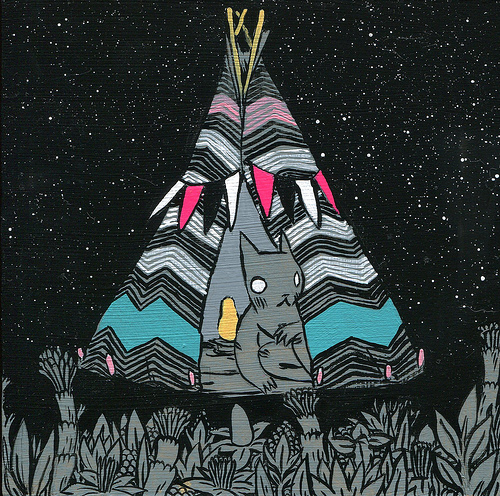
 I thought the idea for this one was quite good and suited the sincere way I feel about the subject (symbolic things seem sincere to me), a clock carrying thought bubbles, I went for pencil because I thought the subject was quite subdued sounding and serious ('needing time to think') then I used lines on ink to set it in a desert canyon because the clock looked a bit  like a vulture and the rest looked melancholy or sort of lonely. Also I didn't want it to be any more cheesy by making the backround a cloudy sky. The border is because it needed containing to make it look less scruffy and doodly, and also because the black and white pencil looked like an old photograph (that might have a border round it). I should have drawn the clock before I drew the thought bubbles, the whole thing looks doodled but the clock looks worst, I think because I had to draw it so small. Picking out main subjects and thinking most about them, seems a good idea.

 For a lot of the time I was making this one it didn't look like it was going to turn out well but I added a load of finishing touches and that made it better, finishing touches are quite important. I also think although painting takes me a long time, it does make me produce more finished looking images (I painted a LOT in pre foundation year studies) so I should do it more.
 With this one I decided to do illustrations that were more for use with some writing to explain them nearby, I enjoy that more because I can be more imaginative without having to worry about people not understanding me, I don't like to keeo doing that though because I do need to get better at communicating just with images. I don't know how to get better at communicating through image alone, I need help with that.
 This one I did after a long break so I had a lot of time to think about it. I feel a fraud when images look good only after I spent ages thinking about them. Producing a sort of set and then sticking characters in there was really fun, I should remember that method.
 I used to think this image was successful at communicating without words then I asked my sister and she didn't understand it, I added the words, but made sure they weren't that explicit because I assumed that would be too literal (now I think about it it probably would have suited the image a lot better, I should note that distinction between what words to use and that some images suit different types of worded explanation) I showed my mum and she didn't understand even with the words, she thought what I had drawn as lava streams underground was a tree and the faces weren't anthropomorphised lava but people running away from the lava. I should not sacrifice clearness for expressive ways of drawing, especially when the drawing is as small as this.
 I found a technique I like in this image, depressing part of the image and using a different material for it to communicate. I also learnt that blowing ink to make random, exciting looking lines has limitations, like it can start looking like a mess really quickly, but it's ok if you don't mind it taking over the image and you factor it in properly, or you're really careful.
Again I used too many expressive lines on the cloud blowng the tree, I should look at ways other than scruffy lines to express ideas or something.
 This was a really quick idea i should have thought for longer about, but I think I started this at the end of a night again so I just wanted to finish it. Part of me thinkgs it needs more levels to it, like a lower level at least to make things stand out more. The other part likes how flat and consistently bright the image is, it was supposed to refer to old neon coloured video games so maybe it works because it looks like a screen. I enjoy the brightness and boldness of the felt tip pens I used for it, also being restricted to less colours was fun (I should use felt tips when I'm tryin to plan a print so I don't use too many colours by accident).
 I found the technique of mottled black felt tip ink on plastic which makes a slick sort of stoney or rough rubbery look (it looks better than in this photo) earlier in the holidays and based the whole idea around getting to use it, I chose it for the image for 'networking' though because networking sounds professional and scary to me. I am pleased with the slightly hidden layer of talking fish and the octopus' book in this because for a representation which is kind of silly, it gives it a bit of depth so it suits more serious subjects (In my opinion, I need to ask other people about that).
 I learnt that conte crayons are actually really nice for drawing surfaces and making a nice colourful image relatively quickly in this one, I always used to hate them, and also collage funnily enough and I actually think it looks intriguing here and nice and bright. I was inspired by a bit of illustration I saw at Middlesex uni open day that was about black hole research I think, it used the same combination of colour and technical or boring old fashioned looking photos to make it interesting to children (I think). The subject of this 'getting access to printing facilities' is kind of a boring thing to have to draw as well. I recognise the technique though, I think it's been done a lot before, cartoony images plus more dry photographs. Perhaps I could have done this better by adding a transition from photo to cartoon rather than leaving the photos jutting out, that seems less cliched.
 I had the idea of making 'knowledge and support' little beasts being released from a box, it came after thinking about pandoras box. Briefly I considered geting some actual wood and veneering the image inspired by the cool patterned veneered boxed you see at car boot sales but that would have taken forever and wasn't worth it, I still want to try it out though. I actually thought laterally in this one which I am happy about, I think it happened because I thought of a way of representing the subject I was comfortable with (beasts). I used pictures of some trees and forests and some planks instead of pictures of wooden surfaces to collage which gave more interesting textures that were sort of pleasently conflicting with the usual veneer, I think it made the image more positive/ less boring.

This sort of achieved what I wanted in the first picture I did of these 15, it was quick and I thought it up quickly and it's relatively simple, what's different I suppose which made it more successful is it's things I enjoy drawing and also know how to compose. I also put words in there because it wouldn't make literal sense without them, this is what I sacrificed for getting to draw something I enjoy more...

At some point I will read all of this back and summerise what I've learnt through having a think about my work.