Friday, 28 September 2012

Illustration: Frank Quitely, Cover to Batman and Robin #6, 2010

 Image source: http://dangerousdays.tumblr.com/page/8

I chose this because: serene outlines (like, they're not flamboyant flicking about or jutting in/out, they look like they are sort of a coating on a 3D model that was already there, what a terrible description...), picking out sort of blunt, honest looking forms and textures, they're very physical, he puts in enough detail and textures and leaves enough white space, the blocks of black are minimal, that it makes you focus on the volume of all the things he's drawn rather than the light over surface of the whole image. That plain kind of gritty display of subjects, letting subjects speak for themselves seems British, or stereotypically British, like an old stiff upper lip guy calling a spade a spade, except it's not a spade, it's Batman.
Also the way in other things he's used frames really inventively, with the same sort of air of not being over the top, doing things just sobrely enough, that is really amazing.

Thursday, 27 September 2012

Illustration: Aubrey Beardsley, Title page for Salome, 1894


Image source: http://web.clas.ufl.edu/users/snod/ABSalTitle-page-WT.html

I chose this because of it's use of nature, bodies, eroticism (or grotesqueness), decoration and fashion, you get the sense Aubrey Beardsley knew just how much of everything to put into an image to get the overall vibe that was needed. I like that you can sort of feel the turn of the century Britain it was made in. The influence of the cultural situation he was making it in and the desire to celebrate beauty and appreciate decadence teamed together make the restraint (in the black and white and even how really well balanced they are, the hard and flat composition and how it managed to be so vogue at the time) and decorative, carefully placed but flourishing and brave looking style he used evoke the British-y satirical, skillful straining within whatever is holding a cultural movement back.
I like the symbolic looking use of natural things like feathers, bodies and plants and flagrant and bold use of other times' or places' styles, wrenching them into a style that is suitable for 1890s uses, the mix of ancient and modern seems quite British.
I also chose it because I sort of feel too well acquaited with images of his that are open and smooth, this one is still sensuous but more interesting and disjointed.
I find it hard to write about his work because I really like it.

Wednesday, 26 September 2012

Illustration: Daniel Clarke, Debris of the Heygate, 2012

 Image source: http://www.itsnicethat.com/articles/student-of-the-month-daniel-clarke
 Daniel Clarke's website: http://www.daniel-clarke.com/

I chose this because it's so grim looking but makes light of it, sort of romanticises it and tries to find some special unconventional beauty in it, which seems a British kind of thing to do. As well as diligently recording things.
I also chose this because it really appeals to me, I find concrete beautiful as well, and lots of things that are supposed to be ugly, like pylons and mobile phone masts. I think Brutalism is lovely when it's done right, (considering it's surroundings and purpose and the climate it's going to be in) as well, I was going to choose something Brutalist for one of the design things but most of them are a bit old and I wanted to look contemporary...

Design: Psalt, Bubble Tank, 2012


Image source: http://www.itsnicethat.com/articles/psalt-bubble-tank
Psalt Design website: http://psaltdesign.co.uk/

I chose this fish bowl because it's a really nice pure sort of wholesome looking thing, just a lump of glass, and they incorporated playfulness and it managed to carry it off looking stylish and ingenius and not tacky. I like how it's got some sort of flair to it, it looks like it's frozen physics, it doesn't look dainty or quirky I think because it does comply with nature, and it does so strongly, it doesn't accentuate nature or go over the top to oppose it, just sort of slots within it looking beautiful but hardy and obvious (like good ideas are supposed to be really good if they seem obvious after they've been thought of). It looks vaguely scientific, like the cliche specialised glass intruments set up full of bright coloured chemicals, which is maybe part of the reason I thought it was quite British looking, like old fashioned victorian lab things, stereotypically British.


Tuesday, 25 September 2012

Design: Darren Wall, Read-Only Memory: Sensible Software 1986-1999, 2012

Images source: http://www.itsnicethat.com/articles/wallzo-sensible-software

I chose this design for a book as something relevant to Britain because it's a book celebrating a small scale British company making small video games (I love these types of games, also I like seeing remnants of the culture surrounding them, like the weird 'Cracked by: *some person's name/nickname*' screens before games on some floppy discs, and the way the tiny resolutioned screens were made the most of in the art, making the most of kind of rubbish stuff sounds a bit British). Putting the tiny characters and environments in the frame of a slick exhibition catalogue type book is a really ingenius idea, it looks postmodern, it sort of continues the happy-go-lucky attitude people must have had to have creating expressive games within so many technological boundaries.

Design: William De Morgan, Lion Rampant, 1888

Image source: http://backtothecastle.blogspot.co.uk/2011/12/wood-school-christmas-meal.html

I chose this because it draws heavily from history like Britain in general which is pretty historical. Also homes in Britain are apparently smaller than a lot of other countries in the west, and I stereotype them as darker, smaller and old (probably because my house is dark and small...). Tiles like this would give that sort of feeling, the little pits of detail and the rich colours and meandering flourishing claustrophobic-y design with a buff, luscious, dragon-like lion (that's black and blue, which is amazing, I thought it was a panther, but it's like he designed a lion made out of saphire, all the colours are jewel like) looks like medieval illumination trying to show off to you and intimidate you at the same time. William De Morgan was inspired by tiles from the middle East, appropriating other culture's things seems traditionally British/ Western too.

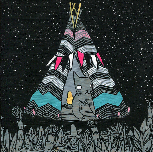
Art: Deth P. Sun, Untitled (?), 2011


 Image source: http://www.dethpsun.com/

Small,  sincere and consequential looking, pleasant, adventurous, playful, gently detailed, dreamy, extremely imaginative, like you're making seperate and sparse observations on the adventures of the little character, indulgent in fantasy and imagination, a bit sombre, matter of fact, like someone mixed Tolstoy with fairy tales. All that's how I would describe the work. I know Deth P. Sun is from America but I see myself pretty much as a citizen of the west in general, there are so many similarities and the world's so small now (also I really like Deth P. Sun). I chose it as something relevant to Britain because it reminds me of quaint, extremely British things like Beatrix Potter stories, things that have a firmly set status as make believe or fanciful but fill out their niche really well and robustly. The style used for the work represents this feeling I think, most of the paintings have the brush strokes left out and proud and they're mostly composed so the event in them looks like it's in little capsule formed by the painting, some of them look like they're in a larger dreamscapey sort of capsule like the ones that look like they're set in an infinate jungle. The style looks cartoony but the poses the characters are in are restrained and calm, also the objects look carefully considered and have just enough unique detail to feel realistic. The work is strong and bold but also careful and grounds itself just enough so it's not too noisy to bother paying attention to.