Friday 26 October 2012

Domestic Narrative

Here's my outcome for the Domestic Narrative Project (I don't know if that's it's actual title, or if it had one...) the first rotational project I've done.
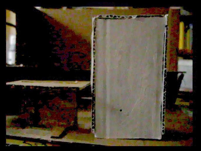
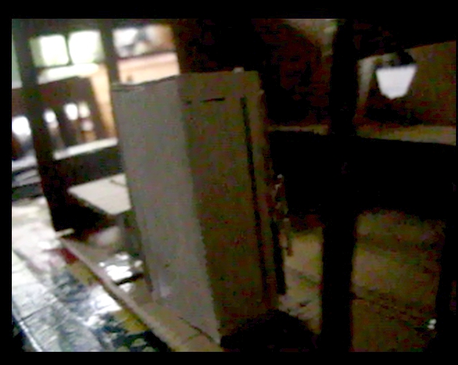
I thought I should also show the stills from the video I made of my model of my kitchen and the fridge, that I used to get the compositions in my narrative, also there's a picture of the model itself because I found out making it that I enjoy making models of rooms/ sets (?). Thinking about things as 3D objects made of different shades of light falling on them is something that comes quite natural to me. It influenced my outcome a lot, not in a very useful way however, I concentrated quite a lot on atmosphere, shadow, textures and the expressive drawing aspect of the brief, but people were confused about the actual narrative in the crit.


I like these stills, I think they look quite scrappy and childish, therefore kind of ominous. I didn't draw a finished image from the last one, I thought I'd leave it a mystery whether the fridge actually had a fire in it or not.

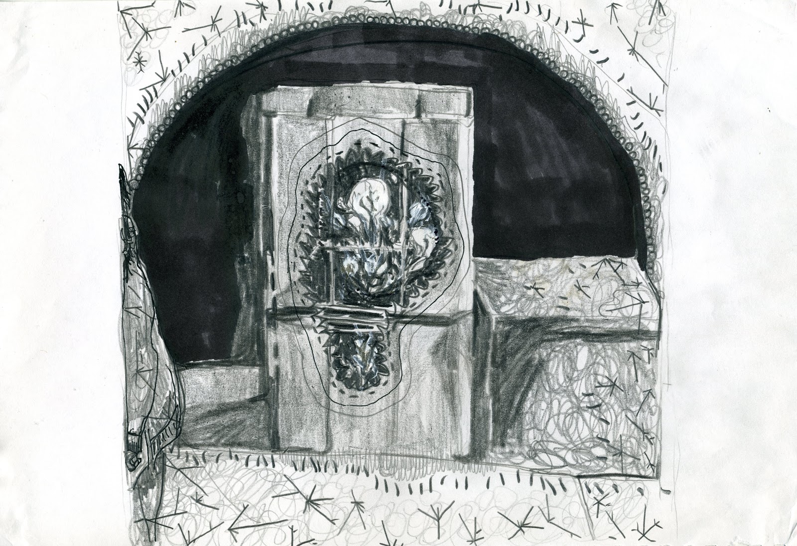
Narrative: A fridge breaks, all it's 'coldness' leaks out and freezes the room around it while inside the fridge a fire erupts.

Pretty Cointreau


I got these minatures from a car boot sale and I think they're really lovely, their little rich coloured centralised labels and the way the bottles are all the same but the contents is different colours, make them jewel-like and appealing.

Thursday 11 October 2012

minifridge

I've made a cardboard model of my  fridge for this project but I can think of too many ways to use it... I could paint it further, or edit the photos of it and keep the real thing white, I could make a little room set for it, I could put drawings inside it, I could draw it in the real life room I'm using as a location for the narrative, I could draw shadin onto it, I could literally set it on fire (as fire in a fridge is part of the narrative I've decided on) and draw that.
I don't know what to choose... maybe I should do whatever and move on. Or wait till after I've done more research, but then I don't want the research to be informed by ideas I already have...
I am thinking too much about this.


Wednesday 10 October 2012

Fridge science (research, rotation project 1)

http://home.howstuffworks.com/refrigerator4.htm

I've been reading this information about fridges, which sounds really boring but I actually find it really quite cool, it reminds me of this article in new scientist about phase changing materials being used to keep buildings cool, with them it was melting and freezing instead of evaporating and condensing, either of these is pretty weird and shocking when it happens in anything that does it to a different temperature to water, the mental images it conjures are alien, like liquid nitrogen, weird.

Friday 28 September 2012

Illustration: Frank Quitely, Cover to Batman and Robin #6, 2010

 Image source: http://dangerousdays.tumblr.com/page/8

I chose this because: serene outlines (like, they're not flamboyant flicking about or jutting in/out, they look like they are sort of a coating on a 3D model that was already there, what a terrible description...), picking out sort of blunt, honest looking forms and textures, they're very physical, he puts in enough detail and textures and leaves enough white space, the blocks of black are minimal, that it makes you focus on the volume of all the things he's drawn rather than the light over surface of the whole image. That plain kind of gritty display of subjects, letting subjects speak for themselves seems British, or stereotypically British, like an old stiff upper lip guy calling a spade a spade, except it's not a spade, it's Batman.
Also the way in other things he's used frames really inventively, with the same sort of air of not being over the top, doing things just sobrely enough, that is really amazing.

Thursday 27 September 2012

Illustration: Aubrey Beardsley, Title page for Salome, 1894


Image source: http://web.clas.ufl.edu/users/snod/ABSalTitle-page-WT.html

I chose this because of it's use of nature, bodies, eroticism (or grotesqueness), decoration and fashion, you get the sense Aubrey Beardsley knew just how much of everything to put into an image to get the overall vibe that was needed. I like that you can sort of feel the turn of the century Britain it was made in. The influence of the cultural situation he was making it in and the desire to celebrate beauty and appreciate decadence teamed together make the restraint (in the black and white and even how really well balanced they are, the hard and flat composition and how it managed to be so vogue at the time) and decorative, carefully placed but flourishing and brave looking style he used evoke the British-y satirical, skillful straining within whatever is holding a cultural movement back.
I like the symbolic looking use of natural things like feathers, bodies and plants and flagrant and bold use of other times' or places' styles, wrenching them into a style that is suitable for 1890s uses, the mix of ancient and modern seems quite British.
I also chose it because I sort of feel too well acquaited with images of his that are open and smooth, this one is still sensuous but more interesting and disjointed.
I find it hard to write about his work because I really like it.

Wednesday 26 September 2012

Illustration: Daniel Clarke, Debris of the Heygate, 2012

 Image source: http://www.itsnicethat.com/articles/student-of-the-month-daniel-clarke
 Daniel Clarke's website: http://www.daniel-clarke.com/

I chose this because it's so grim looking but makes light of it, sort of romanticises it and tries to find some special unconventional beauty in it, which seems a British kind of thing to do. As well as diligently recording things.
I also chose this because it really appeals to me, I find concrete beautiful as well, and lots of things that are supposed to be ugly, like pylons and mobile phone masts. I think Brutalism is lovely when it's done right, (considering it's surroundings and purpose and the climate it's going to be in) as well, I was going to choose something Brutalist for one of the design things but most of them are a bit old and I wanted to look contemporary...